Monday, 22 November 2010

Work placement and Designing....

So good news I have a placement with ITV for a month! I'm so excited, I can't wait for it (need to learn a lot of code...)
But it will be an awesome experience for me.
Secondly, I finished my report in the end, it was hard work but I got it all done and printed (£40?!)
Thirdly, I heard back from the copyright people and they won't let me do an inspector calls... so it's going to be Doctor Faustus... I'm not too distressed about this... it was what I wanted to do... but acutally having to do it is a little daunting... I'm sure I'll be okay
So I'm going to read Fautus EXTREMELY carefully... and hi-light what scenes I think would be the best to do... as well as establish some themes to bring into the new version I'm going to make.
I'm thinking about modernising it to an extent... it's hard to relate to the old version of it. But I will discuss that in more detail as I read the scenes.
But still I have to get a lot done for next Wed character designs, props, backgrounds, storyboards, interactivity samples... so I better get a scoot on!
I draw sketchy version of what I'm going to CG: (At the moment I'm trying to figure out whether it's modern day or not... of whether Mephtophelsis is a man or not)


(CLICK FOR BIG VERSION)
then after that I've done a rough CG in Painttool SAI

Monday, 15 November 2010

It's been a while... apologises....

Sorry that it has taken me a while to update my blog... I've had an essay and a report to do and been sick on top of that...
But I'm on the rigt side of it now and I can happily give the results to my surveys:

THE MOST POPULAR NARRATIVES WERE....

An Inspector Calls
And....
Doctor Faustus

I think that these two are fairly good... I think Jekyl and Hyde came in third... but I can't confirm that at this moment in time...

I'm quite happy with this (if not a little surprized) I didn't think that people would want to see 'an inspector calls'... but an audience can always surprize you....
So that's all good... I'm trying to get copyright for 'an inspector calls' but if that fails... then it's going to be Faustus...

I have also got all my responses from my focus groups... and they are pretty promising... I'll discuss this in greater detail soon.

In other news I'm going to learn HTML5 and Illustrator in preperation for next semster I'll be at ITV at Christmas so I'm starting nice and early so I'm not stressed when I get back (bearing in mind the deadline for prototypes is the 13th of Jan when I'm not here it makes sense to make a start now...).

Also I'll be heading to the Thought Bubble Sequential Arts Festival at the weekend (which is convientantly in Leeds) and be spending a lot of money on comics as... 'research'...
teehehehehe

Thursday, 4 November 2010

Other places to distribute

So after the people are 'World Book day' being less than helpful (saying that I have to be from a school to get an information pack). I have decided to look at other festivals that I could place my project in... these were some promising ideas.
The Sunday Times Oxford Literary Festival, at the end of March (Links with BBC4 for this one)
http://www.oxfordliteraryfestival.com/
The Guardian Hay Festival, in late May
http://www.hayfestival.com/portal/belfast.aspx?skinid=1
Edinburgh International Book Festival, in August
http://www.edbookfest.co.uk/
Cheltenham Festival of Literature, in mid October
(This one even has a future fictions section of the site this is promising!)
http://cheltenhamfestivals.com/tag/future-fictions/

So there are places to distribute this! I haven't lost hope of doing it as a 'non-commercial venture just yet!'
I've planned my questions for my focus group tomorrow and have started my report in some style!
Things are going well

Wednesday, 3 November 2010

Name and logo for project?


I'm going to start writing my report shortly, therefore I'm trying to come up with  some sort of brand name. I've spent a while trying to think of what words to put in the title, and what I want the title to convey about the product. I want to use the word rejuvenation, because I think it accurately describes what I'm trying to do with this project:
re·ju·ve·nate  tr.v. re·ju·ve·nat·ed, re·ju·ve·nat·ing, re·ju·ve·nates
1. To restore to youthful vigor or appearance; make young again.
2. To restore to an original or new condition: rejuvenate an old sofa.
(taken from "http://www.thefreedictionary.com/rejuvenation")
I'm trying to restore the original stories and make them 'young' again. By bringing them up to date and using a new platform, I'm hoping to give them a new lease of life. 
I'm not 100% happy with this wording, I'm not sure if 'Classic rejuvenation Project' makes sense on it's own and it's due to change.
I might also change the wording of the bottom bit, I don't want people to think the stories were 'dead' which 'bringing old stories back to life' suggest.
 
I want the visual style of the logo to be simple, because as a project, this header would need to cater for lots of different titles, so I want a banner that can be used for every kind of story regardless of genre.
I wanted to go with a san-serif font because it seems more modern and contemporary. I think sometimes people can associate serif fonts with 'classic' 'old' 'authoritative' texts (e.g. Times New Roman being a font designed for 'The Times' newspaper.

I think this is something I'll be working on for a while, but at least its in the back of my mind.
(I now have 30 people who have answered the survey. Good times).

Tuesday, 2 November 2010

Feedback from Alt tutor meeting and objectives.

My meeting with my alternative tutor went quite well. He thought that the idea was good and the justification for the product was there. However we both identified the main challenges in this project, most of this information will be found through more indepth research.
  • Finding a place where this product will sit
  • Finding a vehicle to launch it on
  • Defining a niche that the product will appeal to
These problem hi-light some definate food for thought. As much as I would like to make this product appeal to everyone, I'm not sure I can. I mean I don't think that a artefact of this nature will have massive appeal, maybe it would only appeal to people who already use the computer a lot, the general public may not feel inclined to go on there computer and interact with a novel. I will definately need to ask my focus group about this.

This then leads to another key point
  • Will this artefact be part of a campaign with a charity/company/awareness group or will it be a commercial venture?
Clearly this will depend on what my focus group say about how they would the artefact. If enough people said they would use it if they were aware of it, then I would then research into campaigns with a similar theme (e.g. getting people into opera, classical music etc etc) and look at the strategies they use.
If not then I would have to look into the commercial sector and see how things like this are distributed (e.g. look at game selling engines such as Xbox marketplace and steam)

So more research to think about there, but I'll need to speak to my focus group first (and of course formulate some questions for that). 

Monday, 1 November 2010

Survey and Character designs

So I have completed my survey here it is. I have used a snowballing technique where I have sent an email to 25 participants in my address book, all differing ages ranging from 20 to 65, and I have asked each one of those to send it to at least one other person who they know.

Hopefully I will get a reasonable and varied return rate. Failing that I am also distributing it via facebook for a very short period of time. This is a fail safe option. I would prefer to get high numbers, even if the age group is similar. I already have 8 responses (mostly by women and all of the participants have been in their 20's...lets hope I get more varied ones soon.... )

So I am also hoping to get a focus group arranged by the end of this week.

Now to address character and prop design inspiration. I am trying not to get too bogged down with this yet, as I am aware I have a weakness for spending too much time on design in general.
For me personally, it is difficult to be concise in this area.


(Taken from "http://upload.wikimedia.org/wikipedia/commons/thumb/b/b3/Page_004_%28Faust%2C_1925%29.png/392px-Page_004_%28Faust%2C_1925%29.png")


So here we have an illustration from the 1925 version of Doctor Faust, I love this graphic, but I can appriciate that in a new media interactive version people would want something a little more modern and contemporary... But it might be worth looking at these character designs to inform my designs.

I don't want people to associcate this with 'cartoons' and zaniness, but neither do I want the style to be too realistic... or else I think the freedom for expression will be limited.

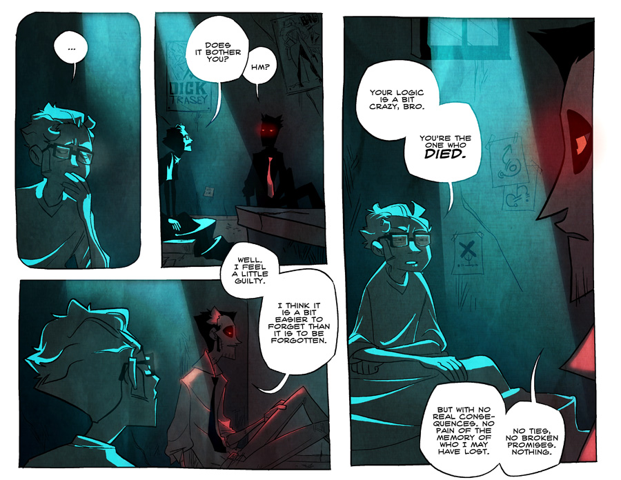
I decided therefore to look into illustrations (and by an extension comics) that aren't for children. This panel is taken from a currently popular online comic (soon to be published) comic called "Hanna is not a boy's name".


(Image taken from "http://fc04.deviantart.net/fs71/f/2010/095/d/4/Easier_to_Forget_by_vert_is_ninja.jpg")


(Image taken from "http://hanna.aftertorque.com/comics/2010-04-06-hbnc_112.jpg")


I really like the 'mood' that is created in this comic, the use of colour conveys atmosphere without too much suggestion of a location. I'd like to use colour in this fashion if I can. I also like the panelling in this... it suggests something about the pace. How I would translate this into a new media narrative I'm not entirely sure, but I like the pace. Even though the style is abstract, it isn't particularly 'childish' although, it is unlikely that it will infulence my style of drawing.


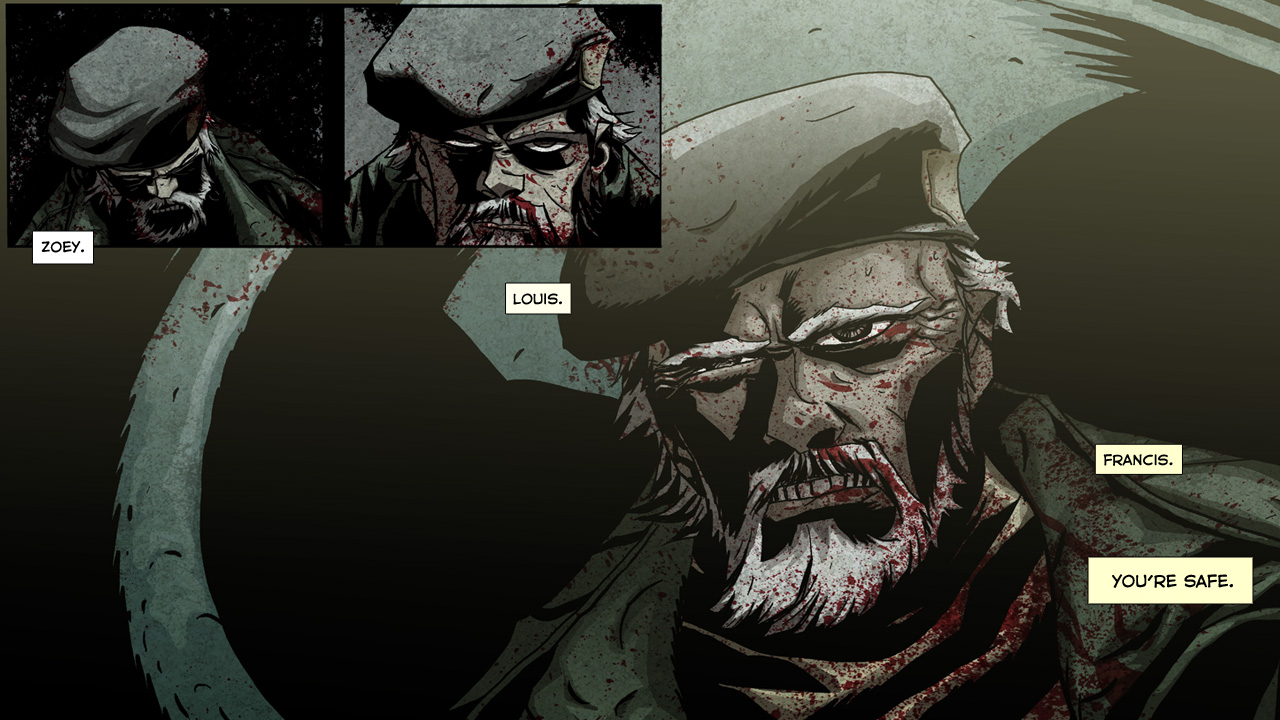
(Taken from "http://www.l4d.com/comic/assets/1280/L4dpg01.jpg)


Another example showing that for adults don't necessarily crave realism (the left for dead 4 comic which is a tie in with the new game franchise), but I think there is a sense of 'edginess' in adult graphics, something that isn't present in comics and illustrations for children (not to mention the odd smattering of blood everywhere)

 (Taken from "http://i167.photobucket.com/albums/u122/naniiebim/Illustration%20work/t100330Meths03flatunfinpg27-28.jpg")


I feel that a combination of the drawing styles from above would create something more suitable for adults, obviously due to the stories in question, the style can't be overly cute and fun. It has to be rich and expressive. I feel that something a little more artistic would be quite good in giving these classics a sense of 'character' that is contemporary
 
Now for something a little less cartoon/ comic based and more illustration(ish)
An old college tutor of mine created these graphics (Malcolm Stanbra), I feel that they would really lend themselves to interactive design. 


The next illustration graphic I have here is from an artist on Deviant art known as 'BlueLudeBar' her use of texture is really interesting, although she usually uses them in quite colourful cheerful images, there is a clear 'adult'ness about these designs.

Visual style and inspiration

This is again, another really important consideration in this classic reboot. After looking at a few New Media narratives/ Games/ Other design media. I have come to a number of conclusions about my graphic representation.

My first concern is that I will be unable to use photography in the conventional sense. Some of these classics will use landscapes and places that I will not be able to photograph. With this in mind, I will be possibly gathering photographs and then enhancing them, possibly by drawing places in and making the images look more dated... alternatively I may just redraw the landscapes all together.


For example I may use an image like this as inspiration and then create the background myself.
(Taken from "http://www.victorianweb.org/technology/railways/41.jpg")

I also realize that I will not really be able to use photographs for many of the characters either as it will be far too difficult to find a 'cast' who will be able to portray the characters effectively. I may use photographs in order to help me re-create certain poses or actions, but it is doubtful that I will use the actual photographs themselves. I am also look at other depictions of the characters in my classic (if any exist)


( Taken from "http://www.aboutwhitby.co.uk/dracula/180px-Draculafaces-small.jpg") As we can see there are a number of different Dracula's here. All seem to suit the different facets of the Dracula character.
I feel that with an illustrative style, the characters representations can be much more expressive and surreal.


(Taken from "http://images1.wikia.nocookie.net/castlevania/images/thumb/7/73/Dracula1_small.jpg/300px-Dracula1_small.jpg")


We can see the influence of all the other kind of Dracula's add up to one whole in this design.

With this in mind I also want to try and move away from the 'overly abstract' imagery and navigation you find in a lot of new media narratives.

See http://www.crissxross.net/elit/underbelly.html as an example. I want the user to understand what is going on, even if it is a little more abstract, I want something they can understand rather than a 'figureative' 'deep and meaningful' interface. I want it to convey a reasonably coherent and linear narrative.

That isn't to say that the images will always be within a 'real world' I just want the images on screen to be understandable.

So for 'real world' events as it were (e.g. Mr Smith is in town). I will find a photograph of a town, or draw a town based on an image. 


When trying to communicate character feeling and possible lines of thought, I would like to have backgrounds that are similar to Alicia Buelow's work.


(Taken from "http://graphics8.nytimes.com/images/2006/02/20/business/businessspecial2/21security.184.jpg")


I think that the use of symbols and texture will really help communicate feelings and thought. Key words may appear at the side, fading in and out, symbols might appear and fade away, similar to this:


In 'the path' dialogue often appears and fades off the screen, this usually helps reveal the narrative.


I will post more about  character and object design soon.

Also going to put the survey up tonight!